Peach Fuzz 2024
•Posted on January 14 2024
Can you live with Peach Fuzz?
Every year we all look forward to what the trend forecaster Pantone tells us will be the colour for the forthcoming year.
Pantone is a major influencer when it comes to Colour of the Year and has been for a while...but now every paint company predicts their colour and, as you will see, these have a tendency to vary. Trend forecasting is usually published 18 months ahead and allows designers and trade buyers guidance for building curated ranges for clothing and homewares.
This year we've looked at 6 predictions for 2024 and there is a definite split; 3 opting for softer pink, peach colours and 2 going dark and moody with dark olive/blacks and 1 opting for a soft green.
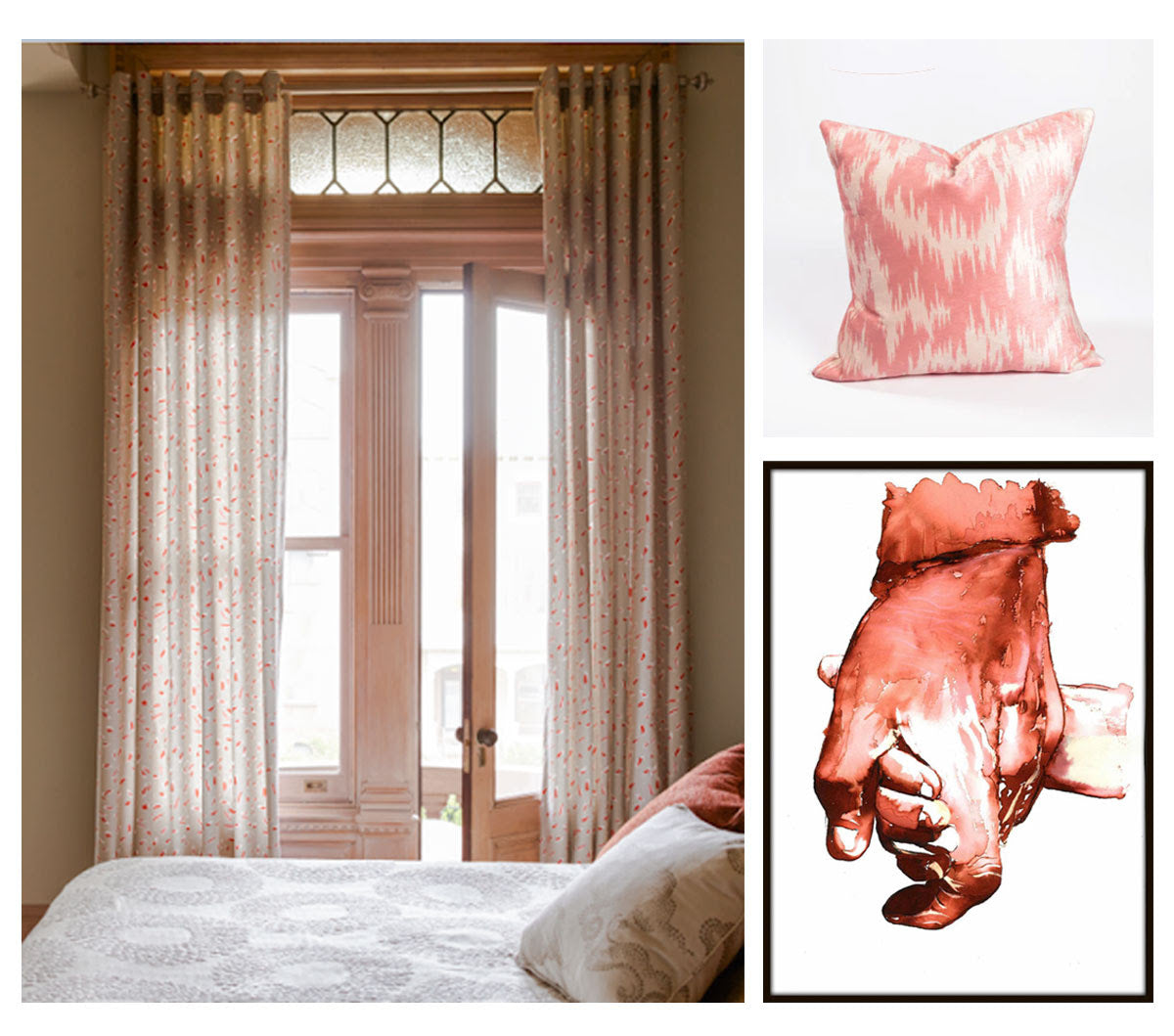
Don't think you have to completely redecorate each year, but these are a good guide as to what you will be seeing on the shopping shelves and where colour trends are moving. I'm not sure of the Peach Fuzz, it's all very 1980's but then that's 40 years ago so new for so many...what do you think? Read on to see how one fabric company has interpreted both the dark accents and peach - it makes redecorating seem like a good idea, even if it is peach...
American Paint company, Dutch Boy have opted for a dark nature-inspired olive green colour “as a great one for anyone who seeks to make their home a “sanctuary for well-being." Ironside is rooted in comfort and creates a space that is elegant and charming. As dark shades become more appreciated in the home, this deep olive is versatile in wide-open spaces or enclosed comfy places, reflecting well-being from all angles.
Dulux, announcing their choice earlier than Pantone, have selected a very soft pink that has a lot of grey in it. It’s a barely-there pink; their creative director says 'when life is complex and we need to decompress and step back from the complexity of life to find quiet moments of calm'.
Taking centre stage, Pantone is defining 2024 with “Peach Fuzz”. They say they picked this soft peach because for them it brings up feelings of peace and serenity. “We’re going through a lot of turmoil in our lives, and we have a need for a colour that’s nurturing,” says Pantone colour specialist Leatrice Eisman. “It’s a warm and cozy shade. And it’s very tactile. We feel that at a time like this, tactility is really important. To touch other people and gather them into our homes.”
American paint company Behr went for “Cracked Pepper,” another darker tone, this time a soft black colour which they say evokes a sense of confidence and individuality that they want all of their customers to feel after completing a project. “We recognise the growing desire for using darker colours throughout spaces,” says Jodi Allen, the company’s global chief marketing officer.
Similar to Pantone, American paint company Sherwin-Williams have chosen an earthier tone - they describe it as an earthy terracotta that is both calming and cheerful and they say it promotes positive relationships and conversation.

So while Pantone and Dulux get lots of headlines here in the UK, one of our suppliers Graham and Brown, have been producing their own colour of the year.
Standing on their own in choice of colour, the ethos is similar in offering a calming atmosphere. A beautiful muted green colour, their Colour of the Year 2024 has been conscientiously curated to create a warm and welcoming space. 'Viridis is the perfect embodiment of the fertile green hills around us. It can be used in small cosy spaces to create a calming effect or in larger rooms to transform the space into a sophisticated yet relaxing space. It is especially perfect for the entertaining and entrance areas where outside and inside meet.'

Will you be following a colour trend? Hop over the our socials and let us know.